hagis: Tools for Analysis of Plant Pathogen Pathotype Complexities, Distributions and Diversity
Austin McCoy and Zachary Noel
2025-09-24
Source:vignettes/hagis.Rmd
hagis.RmdGetting Started With {hagis}
The following examples are based on a dataset from Michigan State University Phytophthora sojae surveys for soybean phytophthora root rot pathotyping efforts.
First you’ll want to load in your data set, for right now let’s use a
practice data set made for the {hagis} package, named
P_sojae_survey. The data set is available in your R session
automatically when you load the {hagis} package.
library("hagis")
head(P_sojae_survey)
#>    Isolate         Line         Rps Total HR (1) Lesion (2)
#>      <int>       <char>      <char> <int>  <int>      <int>
#> 1:       1     Williams susceptible    10      0          0
#> 2:       1       Harlon      Rps 1a    10      4          0
#> 3:       1 Harosoy 13xx      Rps 1b     8      0          0
#> 4:       1     L75-3735      Rps 1c    10     10          0
#> 5:       1    PI 103091      Rps 1d     9      2          0
#> 6:       1  Williams 82      Rps 1k    10      0          0
#>    Lesion to cotyledon (3) Dead (4) total.susc total.resis perc.susc perc.resis
#>                      <int>    <int>      <int>       <int>     <int>      <int>
#> 1:                       0       10         10           0       100          0
#> 2:                       0        6          6           4        60         40
#> 3:                       0        8          8           0       100          0
#> 4:                       0        0          0          10         0        100
#> 5:                       1        6          7           2        78         22
#> 6:                       0       10         10           0       100          0
We see in the gene column that each gene is prepended
with “Rps”. We can remove this to make the graphs cleaner and report the
genes in tables as we would in a manuscript. Note that this will work
for any string you enter as the first value, pattern. The
second string, replacement, is the replacement value, the
third, x, is where to look and make the changes.
P_sojae_survey$Rps <-
  gsub(
    pattern = "Rps ",
    replacement = "",
    x = P_sojae_survey$Rps
  )
head(P_sojae_survey)
#>    Isolate         Line         Rps Total HR (1) Lesion (2)
#>      <int>       <char>      <char> <int>  <int>      <int>
#> 1:       1     Williams susceptible    10      0          0
#> 2:       1       Harlon          1a    10      4          0
#> 3:       1 Harosoy 13xx          1b     8      0          0
#> 4:       1     L75-3735          1c    10     10          0
#> 5:       1    PI 103091          1d     9      2          0
#> 6:       1  Williams 82          1k    10      0          0
#>    Lesion to cotyledon (3) Dead (4) total.susc total.resis perc.susc perc.resis
#>                      <int>    <int>      <int>       <int>     <int>      <int>
#> 1:                       0       10         10           0       100          0
#> 2:                       0        6          6           4        60         40
#> 3:                       0        8          8           0       100          0
#> 4:                       0        0          0          10         0        100
#> 5:                       1        6          7           2        78         22
#> 6:                       0       10         10           0       100          0
This practice data set contains 21 isolates’, Isolate,
virulence data on a set of 14 differential soybean cultivars,
Line. This package uses the percentage of
susceptible, inoculated, plants to determine effective resistance genes,
pathotype diversity and frequency, as well as individual isolates
pathotypes.
To help ensure that the proper data are used in calculations, the user is asked to provide some information that instruct {hagis} about what data to use.
Function Arguments Used in {hagis}
We have striven to make {hagis} as intuitive to use as possible. Part
of that means that we have used the same arguments for the three main
functions, summarize_gene(),
calculate_complexities() and
calculate_diversities(). Each of these functions take the
same arguments:
xthis is your data set name, e.g.,P_sojae_surveyfrom the example above, allows for the function to identify where it will be pulling these columns (and their associated row values) from to use (i.e. your data collection Excel spreadsheet)cutoffthis value sets the cutoff for susceptible reactions. For example,cutoff = 60means that all genes with 60% or more of the plants rated susceptible will be treated as susceptible. You can change this to whatever percentage you require for your study.controlspecifies the value used in thegenecolumn to denote a susceptible control used in the studysamplespecifies the column header for the column which identifies the isolates testedgenespecifies the column header for the column which identifies the genes testedperc_suscspecifies the column header for the column which identifies the percent susceptible plants for each gene
Ordinarily you would use functions in {hagis} or other R packages like this:
Rps.summary <- summarize_gene(
  x = P_sojae_survey,
  cutoff = 60,
  control = "susceptible",
  sample = "Isolate",
  gene = "Rps",
  perc_susc = "perc.susc"
)
However, because the functions share arguments we can create a
list() of arguments and share them with some of the
functions from {hagis}. First, we make a list of the arguments that
summarize_gene(), calculate_diversities() and
calculate_complexities() use that specify our inputs based
on our example data:
hagis_args <- list(
  x = P_sojae_survey,
  cutoff = 60,
  control = "susceptible",
  sample = "Isolate",
  gene = "Rps",
  perc_susc = "perc.susc"
)
Now that we have a list of arguments, we can now save time entering the same data for each function and also avoid typos or entering different cutoff values, etc. between the functions.
Determination of Effective Resistance Genes
Below is an example of tables and graphics that can be produced using
the summarize_gene() function to identify effective
resistance genes tested against the sampled Phytophthora sojae
population.
The summarize_gene() function allows you to produce a
detailed table showing the number of virulent isolates
(N_virulent_isolates), as well as offering a percentage of
the isolates tested which are pathogenic on each gene
(percent_pathogenic).
Rps.summary <- do.call(summarize_gene, hagis_args)

Rps.summary
#>            gene N_virulent_isolates percent_pathogenic
#>          <char>               <num>              <num>
#>  1: susceptible                  21          100.00000
#>  2:          1a                  21          100.00000
#>  3:          1b                  15           71.42857
#>  4:          1c                  20           95.23810
#>  5:          1d                  16           76.19048
#>  6:          1k                  18           85.71429
#>  7:           2                  14           66.66667
#>  8:          3a                   5           23.80952
#>  9:          3b                  20           95.23810
#> 10:          3c                   4           19.04762
#> 11:           4                   5           23.80952
#> 12:           5                  13           61.90476
#> 13:           6                  11           52.38095
#> 14:           7                  21          100.00000
Using the pander library we can make the table much more attractive in RMarkdown.
| gene | N_virulent_isolates | percent_pathogenic |
|---|---|---|
| susceptible | 21 | 100 |
| 1a | 21 | 100 |
| 1b | 15 | 71.43 |
| 1c | 20 | 95.24 |
| 1d | 16 | 76.19 |
| 1k | 18 | 85.71 |
| 2 | 14 | 66.67 |
| 3a | 5 | 23.81 |
| 3b | 20 | 95.24 |
| 3c | 4 | 19.05 |
| 4 | 5 | 23.81 |
| 5 | 13 | 61.9 |
| 6 | 11 | 52.38 |
| 7 | 21 | 100 |
Plotting Rps Summary Data
{hagis} also provides functions to quickly graph your data using {ggplot2}.
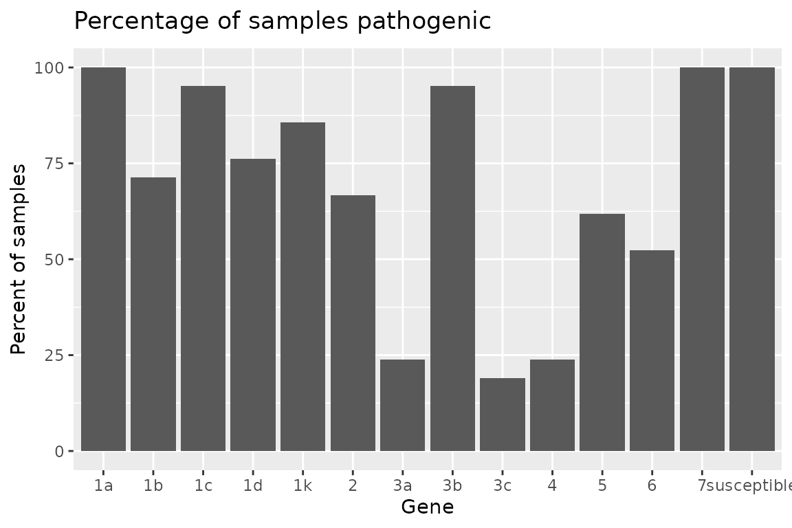
Two functions are provided to plot the summary depending on your
needs. If you need the frequency, use
autoplot(Rps.summary, type = "percentage"), or if you
desire the distribution
autoplot(Rps.summary, type = "count"). Both return the same
graph, only the y-axis change; percent for frequency and n for
distribution.
autoplot(Rps.summary, type = "percentage")
autoplot(Rps.summary, type = "count")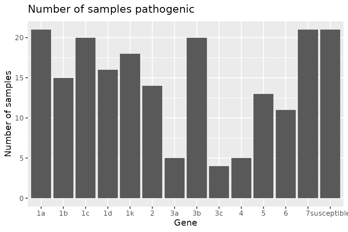
Pathotype Complexities
Pathotype frequency, distribution as well as statistics such as mean
pathotype complexity can be calculated using the
calculate_complexities() function. This function will
return a list() of two data.table() objects,
grouped_complexities and
individual_complexities. grouped_complexities
returns a list() as a data.table() object
showing the frequency and distribution of pathotype complexities for the
sampled population. individual_complexities() returns a
list() as a data.table() object showing each
individual isolates pathotype complexity. An isolates pathotype
complexity refers to the number of resistance genes that it is able to
overcome and cause disease on, i.e., a pathotype complexity of
“7” would mean that isolate can cause disease on 7 different resistance
genes.
complexities <- do.call(calculate_complexities, hagis_args)

complexities
#>
#> Grouped Complexities
#>     complexity frequency distribution
#>         <fctr>     <int>        <int>
#>  1:          1         0            0
#>  2:          2         0            0
#>  3:          3         0            0
#>  4:          4         0            0
#>  5:          5         1            1
#>  6:          6         2            2
#>  7:          7         2            2
#>  8:          8         7            7
#>  9:          9         0            0
#> 10:         10         5            5
#> 11:         11         3            3
#> 12:         12         0            0
#> 13:         13         1            1
#>
#>
#> Individual Complexities
#>     sample N_samp
#>     <char>  <num>
#>  1:      1     10
#>  2:      2     10
#>  3:      3     10
#>  4:      4      8
#>  5:      5      8
#>  6:      6      8
#>  7:      7      8
#>  8:      8      8
#>  9:      9      6
#> 10:     10      5
#> 11:     11      6
#> 12:     12      8
#> 13:     13      7
#> 14:     14      8
#> 15:     15     11
#> 16:     16      7
#> 17:     17     10
#> 18:     18     10
#> 19:     19     11
#> 20:     20     11
#> 21:     21     13
#>     sample N_samp
Once again, using pander we can make these tables much more
attractive in RMarkdown. Since complexities is a
list() object, we can refer to each object directly by name
and print them as follows.
pander(complexities$grouped_complexities)| complexity | frequency | distribution |
|---|---|---|
| 1 | 0 | 0 |
| 2 | 0 | 0 |
| 3 | 0 | 0 |
| 4 | 0 | 0 |
| 5 | 1 | 1 |
| 6 | 2 | 2 |
| 7 | 2 | 2 |
| 8 | 7 | 7 |
| 9 | 0 | 0 |
| 10 | 5 | 5 |
| 11 | 3 | 3 |
| 12 | 0 | 0 |
| 13 | 1 | 1 |
pander(complexities$individual_complexities)| sample | N_samp |
|---|---|
| 1 | 10 |
| 2 | 10 |
| 3 | 10 |
| 4 | 8 |
| 5 | 8 |
| 6 | 8 |
| 7 | 8 |
| 8 | 8 |
| 9 | 6 |
| 10 | 5 |
| 11 | 6 |
| 12 | 8 |
| 13 | 7 |
| 14 | 8 |
| 15 | 11 |
| 16 | 7 |
| 17 | 10 |
| 18 | 10 |
| 19 | 11 |
| 20 | 11 |
| 21 | 13 |
Using summary() will return the mean, standard error
(se) and standard deviation (sd) for pathotypes of a complexities
object.
| Mean | SD | SE |
|---|---|---|
| 8.714 | 2.004 | 0.4372 |
Plotting Complexities Data
Two functions are provided to plot the complexities depending on your
needs. If you need the frequency, use
autoplot(complexties, type = "percentage"), or if you
desire the distribution
autoplot(complexities, type = "count"). Both return the
same graph, only the y-axis change; percent for frequency and n for
distribution.
autoplot(complexities, type = "percentage")
autoplot(complexities, type = "count")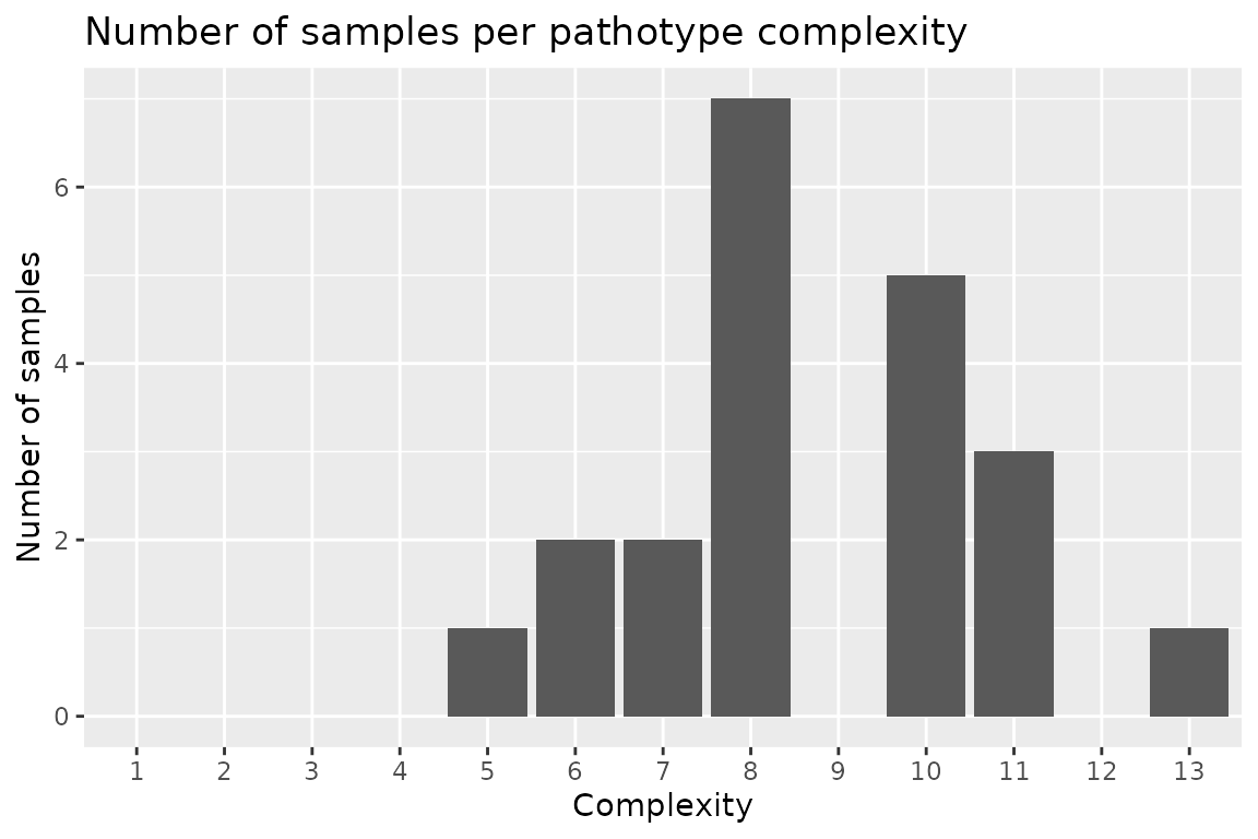
Diversity Indices, Frequency of Unique Pathotypes and Individual Isolate Pathotypes
Diversity indices are extremely useful when trying to identify
differences between two populations. Here, pathotype diversities are
calculated for the isolate population using the
calculate_diversities() function. Likewise, individual
isolates’ pathotypes, number of isolates used in the study, number of
pathotypes within the study are calculated.
Five diversity indices are calculated when calling
calculate_diversities().
Simple diversity index, which will show the proportion of unique pathotypes to total samples. As the values gets closer to 1, there is greater diversity in pathoypes within the population. Simple diversity is calculated as: where is the number of pathotypes and is the number of samples.
Gleason diversity index, an alternate version of Simple diversity index, is less sensitive to sample size than the Simple index. Where is the number of pathotypes and is the number of samples.
Shannon diversity index is typically between 1.5 and 3.5, as richness and evenness of the population increase, so does the Shannon index value. Where is the proportional abundance of species .
Simpson diversity index values range from 0 to 1, 1 represents high diversity and 0 represents no diversity. Where diversity is calculated as:
Evenness ranges from 0 to 1, as the Evenness value approaches 1, there is a more even distribution of each pathotype’s frequency within the population. Where Evenness is calculated as: where is the Shannon diversity index and is the number of pathotypes.
diversity <- do.call(calculate_diversities, hagis_args)
diversity
#>
#> hagis Diversities
#>
#> Number of Samples 21
#> Number of Pathotypes 19
#>
#> Indices
#> Simple   0.9047619
#> Gleason  5.912257
#> Shannon  2.912494
#> Simpson  0.9433107
#> Evenness  0.9891509
Or using pander for reporting, a nice table is
generated.
pander(diversity)| Simple | Gleason | Shannon | Simpson | Evenness |
|---|---|---|---|---|
| 0.9048 | 5.912 | 2.912 | 0.9433 | 0.9892 |
Table of Diversities
To generate a table of diversities, use
diversities_table(). {hagis} will automatically create a
pander object for you. This is because it is much easier to
read the resulting table in the console than the raw
data.frame and insert into reports.
diversities_table(diversity)| Frequency | Pathotype |
|---|---|
| 1 | 1a, 1b, 1c, 1d, 1k, 2, 3a, 3b, 3c, 4, 5, 6, 7 |
| 1 | 1a, 1b, 1c, 1d, 1k, 2, 3a, 3b, 3c, 5, 7 |
| 1 | 1a, 1b, 1c, 1d, 1k, 2, 3a, 3b, 3c, 6, 7 |
| 1 | 1a, 1b, 1c, 1d, 1k, 2, 3b, 4, 5, 6, 7 |
| 1 | 1a, 1b, 1c, 1d, 1k, 2, 3b, 4, 5, 7 |
| 1 | 1a, 1b, 1c, 1d, 1k, 2, 3b, 4, 6, 7 |
| 2 | 1a, 1b, 1c, 1d, 1k, 2, 3b, 7 |
| 1 | 1a, 1b, 1c, 1d, 1k, 2, 6, 7 |
| 1 | 1a, 1b, 1c, 1d, 1k, 3a, 3b, 5, 6, 7 |
| 1 | 1a, 1b, 1c, 1d, 1k, 3b, 7 |
| 1 | 1a, 1b, 1c, 1k, 2, 3b, 3c, 4, 6, 7 |
| 1 | 1a, 1b, 1c, 1k, 3b, 5, 6, 7 |
| 1 | 1a, 1b, 1c, 1k, 3b, 5, 7 |
| 1 | 1a, 1b, 1d, 1k, 2, 3a, 3b, 5, 6, 7 |
| 2 | 1a, 1c, 1d, 1k, 2, 3b, 5, 7 |
| 1 | 1a, 1c, 1d, 1k, 2, 3b, 6, 7 |
| 1 | 1a, 1c, 1d, 3b, 5, 7 |
| 1 | 1a, 1c, 3b, 5, 6, 7 |
| 1 | 1a, 1c, 3b, 5, 7 |
To generate a table of individual pathotypes, use
individual_pathotypes(). Here again, {hagis} provides a
pander object for ease of use.
Table of Individual Pathotypes
individual_pathotypes(diversity)| Sample | Pathotype |
|---|---|
| 1 | 1a, 1b, 1d, 1k, 2, 3a, 3b, 5, 6, 7 |
| 10 | 1a, 1c, 3b, 5, 7 |
| 11 | 1a, 1c, 3b, 5, 6, 7 |
| 12 | 1a, 1b, 1c, 1d, 1k, 2, 6, 7 |
| 13 | 1a, 1b, 1c, 1d, 1k, 3b, 7 |
| 14 | 1a, 1b, 1c, 1k, 3b, 5, 6, 7 |
| 15 | 1a, 1b, 1c, 1d, 1k, 2, 3b, 4, 5, 6, 7 |
| 16 | 1a, 1b, 1c, 1k, 3b, 5, 7 |
| 17 | 1a, 1b, 1c, 1d, 1k, 2, 3b, 4, 5, 7 |
| 18 | 1a, 1b, 1c, 1d, 1k, 3a, 3b, 5, 6, 7 |
| 19 | 1a, 1b, 1c, 1d, 1k, 2, 3a, 3b, 3c, 6, 7 |
| 2 | 1a, 1b, 1c, 1k, 2, 3b, 3c, 4, 6, 7 |
| 20 | 1a, 1b, 1c, 1d, 1k, 2, 3a, 3b, 3c, 5, 7 |
| 21 | 1a, 1b, 1c, 1d, 1k, 2, 3a, 3b, 3c, 4, 5, 6, 7 |
| 3 | 1a, 1b, 1c, 1d, 1k, 2, 3b, 4, 6, 7 |
| 4 | 1a, 1c, 1d, 1k, 2, 3b, 5, 7 |
| 5 | 1a, 1c, 1d, 1k, 2, 3b, 6, 7 |
| 6 | 1a, 1c, 1d, 1k, 2, 3b, 5, 7 |
| 7 | 1a, 1b, 1c, 1d, 1k, 2, 3b, 7 |
| 8 | 1a, 1b, 1c, 1d, 1k, 2, 3b, 7 |
| 9 | 1a, 1c, 1d, 3b, 5, 7 |
Advanced Plotting
{hagis} autoplot() Objects
Since {hagis} uses {ggplot2} to generate its plots, you can easily
theme the outputs using common {ggplot2} themes and other options
provided by {hagis} directly through autoplot().
Changing the ggplot2 Theme
Use {ggplot2}’s theme_minimal() theme.
Rps.plot <- Rps.plot +
  theme_minimal()

Rps.plot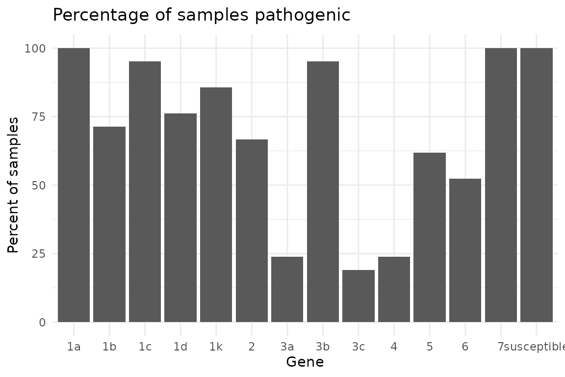
Changing the Font
Set the font to be a bold-face serif family font.
Rps.plot <- Rps.plot +
  theme(text = element_text(face = "bold", family = "serif"))

Rps.plot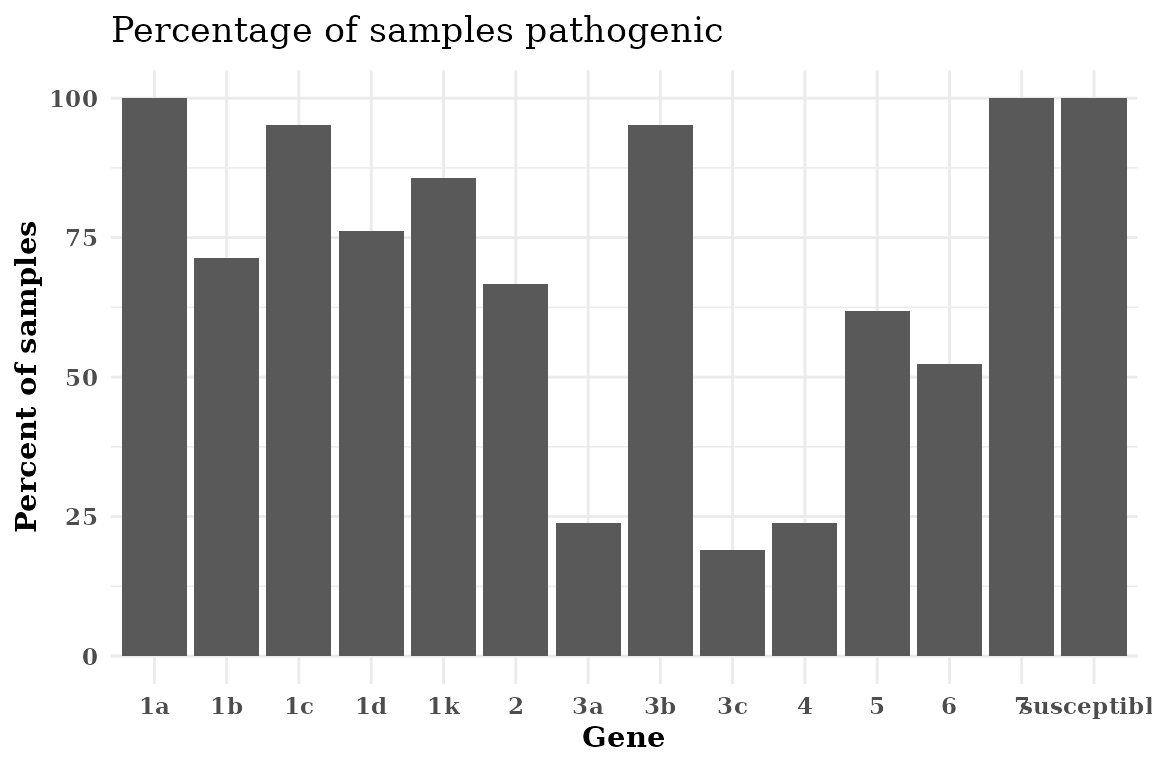
Make a Horizontal Plot
If your Rps gene names are too long, flipping the axis can make the graph more legible without rotating the x-axis labels.
Rps.plot <- Rps.plot +
  coord_flip()

Rps.plot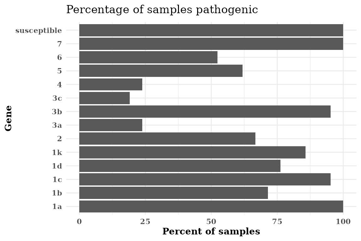
Use Colors in Autoplot Objects
You can use named, e.g., “red”, “yellow”, “blue”, colors in
R or you can use custom hexadecimal color codes. Illustrated below is
using Michigan State University (MSU) Green, hex code #18453b, using
theme_bw() with a serif font.
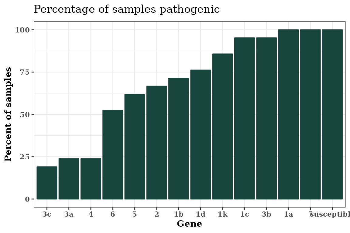
autoplot(Rps.summary, type = "percentage", color = "#18453b") +
  theme_bw() +
  theme(text = element_text(face = "bold", family = "serif"))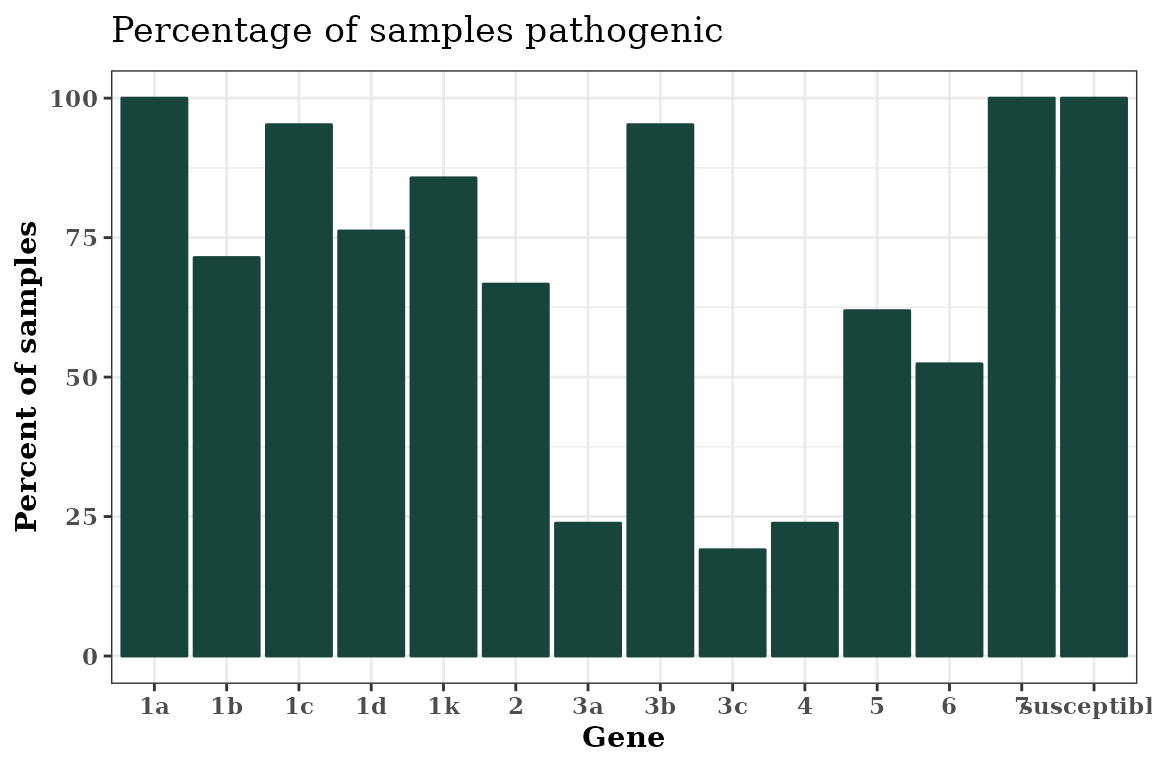
Sorting the x-axis
You can sort the x-axis of any graph produced using
autoplot() in an ascending or
descending order using the order parameter in
autoplot().
autoplot(
  Rps.summary,
  type = "percentage",
  color = "#18453b",
  order = "ascending"
) +
  theme_bw() +
  theme(text = element_text(face = "bold", family = "serif"))